
Morgan McAllister, Eleuthromania, 2016 paint on canvas 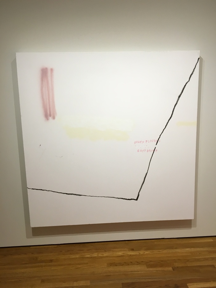
The emotions that this piece invokes in me is a rather peaceful but empty emotion. The painting colors for this canvas are not only warm and playful but the sharp black line that dominates the canvas helps give order to the canvas itself. The dark line, so simple and directional, is what allows the audience fill the painting with their own emotion. In my case, I feel a warm lonesome sensation yet this dark line helps invoke a sense of order within the canvas though there is no visual pattern whatsoever! The geometrical use of this dark line is what allows for its angles to dominate the canvas with an authoritative yet legitimate reason, causing a fluent visual with the other colors which are much more passive and warm acting as complementaries to the dominant dark line.
 This painting reminds me a lot of my own childhood paintings in kindergarten simply because of the playful way of displaying a home through the simple shaping of a square and triangle. The building is not only a realistic image but an illusion through Morgan’s painting stroke as she helps create it with crooked lines.The fact that it is not linear and precise adds a sense of humanity and childlike connotation. On the bottom right of the painting is what can be seen as a distant cross being viewed from a bottom side angle. At sight I did not associate this with a any sort of religion but I did associate it with a sense of a past time on behalf of the painter. It looks more like an electrical light post but these assumptions could only be answered by the painter herself. The bleeding of the white paint on 3 edges while the red dominates the middle and bleeds on the right edge is an interesting approach that the artist really took into consideration since it dominates the whole canvas. The interest of using this 3-1 ratio adds a deeper meaning that I can’t grasp on just yet but also the black stroke to merge the white and red portions of the canvas near the right side of the edge adds to the ‘visual separation’ of this canvas that displays a red canvas being layed over a white canvas.

The emotion invoked through this painting is confusing and chaotic yet as the viewer, I get no sense of threat or insidious context from this painting. This is surprising since the dominant colors are red, black and white, with red and black being symbolic to symbols of power. I believe the white does indeed tone down the chaos and authority of the red and black on the canvas but it also create a ‘sense of wonder’ type of background where the white allows for the other colors to travel as if they’re on an infinite space. This gives the whole canvas a rhythmic visual from the light red squiggles on the top of the canvas, looking as if they would continue to move in the same pattern outside of the canvas. An interesting part to this painting is the offset doc of paint that is located in the lower middle of the canvas. This box serves as a base for the home residing above it but it also creates a whole different canvas within the 2×4 canvas. This is done by making the boxed painting a visually disturbing pattern that does not match the visual patterns around the rest of the canvas. Morgan’s play of visuals with the paintings allows me as the viewer to separate both sections of the painting in my head and attempt predicting what is left underneath the box that has been removed off the canvas.

This painting reminds me of a blurred recovery stage, almost like the recovery stage of an interior of a home when its paint or walls have been damaged. Through this visual, I feel the sense of internal recovery being conveyed through the white washed canvas. Almost like a blur phase in one’s mind, Morgan uses the simple combination of two colors with shading to convey the binary mixed emotions of the canvas. The shading in my opinion narrates the piece itself, providing a free roam like narrator that doesn’t exactly tell a story yet invites for the viewer to fill it with their own perception as the emptiness of the painting allows for the viewer to run off in their own imagination. The top edge of the piece, though the color is dominant, further adds to the emptiness of the piece as the white then becomes a spatial realm surrounded by brown bleeding edges.

This picture attracted me the most of all because of how it gave me the effect of a visual pattern. As I observed the painting, I began to get comfortable with the black crayon/pastel squiggles that are associated across the whole painting. As I began to observe it more closely, these lines go underneath the layering of the pink paint. The effect that I like about this painting is that we as the viewers already know these lines are layered beneath the pink paint yet they vanish from sight as Morgan paints over these huge chaotic squiggles of the black pastel while leaving smaller section out in sight, some being surrounded by pink painting and others being left to wonder off the chaos of the rest of the painting. The use of spacing and contrast is applied in multiple contexts as Morgan plays with the audiences visuality of what is truthfully there beneath the blobs of pink or other dominant color blobs. The reaction that I get out of all this chaos is almost like an organized chaos, a chaos that is not exactly rhythmic but rather well balanced throughout the whole canvas. The whole perception that I read out of this painting is that realistically there are many more squiggles and painting blobs layered on the painting that we may not see and Morgan plays with our perception of viewing reality from illusion. As she allows the contrast and laying of paintings to dominate the whole canvas, she also leaves little hints of layering to display that there is much more complexity going on beneath all layers of paint. The painting to me is very symbolic of how we as people can view each other externally but are clueless on what others feel internally yet we are given hints through body language and direct verbal communication.

I really liked how this piece invokes a comical realm with the use of thin black lines and grey shading. In addition, the dominant dark box hangs into this sequence, making me try to imagine how long this box hangs from its illusional ceiling. The use of grey shading is one of my favorite tactics used here by Morgan. The reason for this is because the gray shading overlays a ‘lamp head’ like figure with bright yellow looking like a light bulb. The irony of using grey shading to convey this is what I believe to be one of the most savvy tactics in this piece. This same effect can be applied with the left portion of the piece as shading is used below the dark box to possibly convey more streams of light.

For this piece, i wasn’t really fully able to decide what I was exactly thinking while looking at it. It is almost as if Morgan wanted to give stigma to the piece by creating shading of white in the lower half that nearly looks like a mist surrounding a towering object. The green paint within the tower creates the emotion of empowerment internally within there towering object. Due to the shading of white over the green, the green looks as if it is traveling upwards with a stronger compression as it nears the top of the wearing object.
